

PrestaShop 9.2 was released recently, and the platform continues to evolve. The new version introduced One Page Checkout, expanded customization possibilities with Extra Properties, and added Ask AI in the back office.
But after installing or upgrading PrestaShop, another important question appears:
What will the store actually look like to the customer?
You can run the latest PrestaShop version, install modern modules and configure payments, while still having a storefront that looks several years old.
That is why a modern ecommerce theme is no longer just about colors, fonts and a large homepage banner.
A good theme should bring the entire customer journey together — from the first visit to the final step before checkout.
The Homepage Should Help Customers Shop, Not Just Look Good
Many ecommerce homepages try to show everything at once: a huge banner, dozens of categories, promotions, benefits, brands, bestsellers and reviews.
The result is often a visually busy page where visitors do not immediately understand what to do next.
A modern ecommerce storefront works differently.
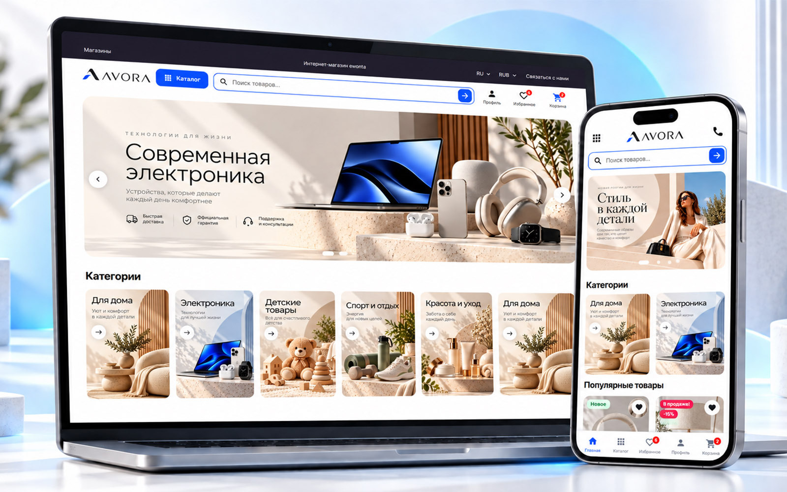
The first screen should clearly communicate the main offer, provide quick access to search and navigation, and then naturally guide visitors toward categories and products.
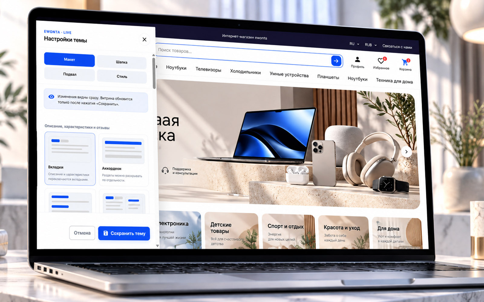
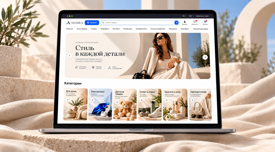
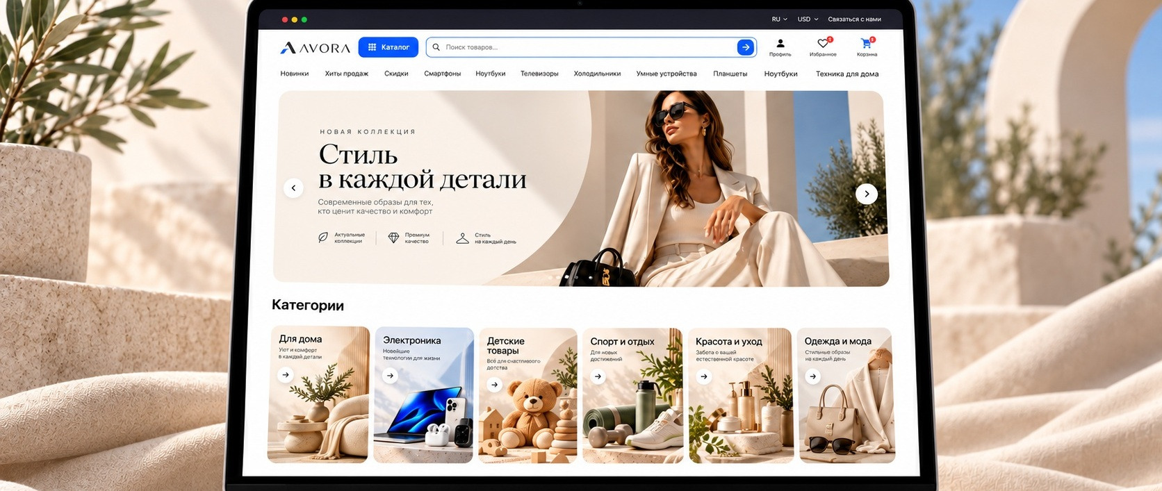
Ewonta 3.0 follows this approach with a strong hero area, fast search, clear categories and product sections without unnecessary visual overload.
The theme is also not tied to a specific industry. The same storefront can be adapted for fashion, electronics, home products, cosmetics and many other types of ecommerce businesses.
Mobile Experience Matters Just as Much as Desktop
Responsive design is no longer a competitive advantage. It is simply expected.
But there is a major difference between a website that technically fits on a phone and a store that is actually comfortable to use on mobile.
On a smartphone, customers need:
- easy access to search;
- clear navigation;
- readable product cards;
- quick access to wishlist and cart;
- controls designed for touch;
- less unnecessary information on each screen.
This is why mobile layouts should be designed intentionally instead of simply shrinking the desktop interface.
These screens should show one important thing: the customer gets a complete mobile shopping experience, not a limited copy of the desktop version.
The Product Catalog Should Help Customers Find What They Need
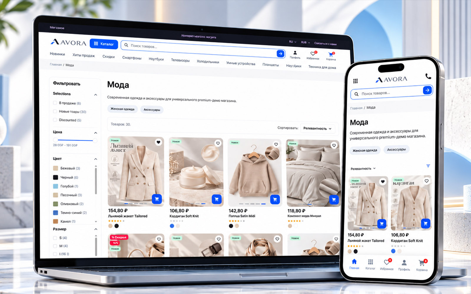
The larger the assortment becomes, the more important catalog structure is.
In a small store, customers may still browse through a few dozen products manually. With hundreds or thousands of products, this quickly becomes impractical.
A good PrestaShop theme should support:
- categories and subcategories;
- filtering;
- sorting;
- active filter visibility;
- quick product actions;
- clear product grids;
- comfortable mobile navigation.
This is especially important for fashion stores, electronics, automotive parts, cosmetics and other catalogs where customers rely heavily on product attributes.
Product Pages Should Answer Questions Before Purchase
The product page is one of the most important parts of any ecommerce store.
This is where the customer decides whether to buy or leave.
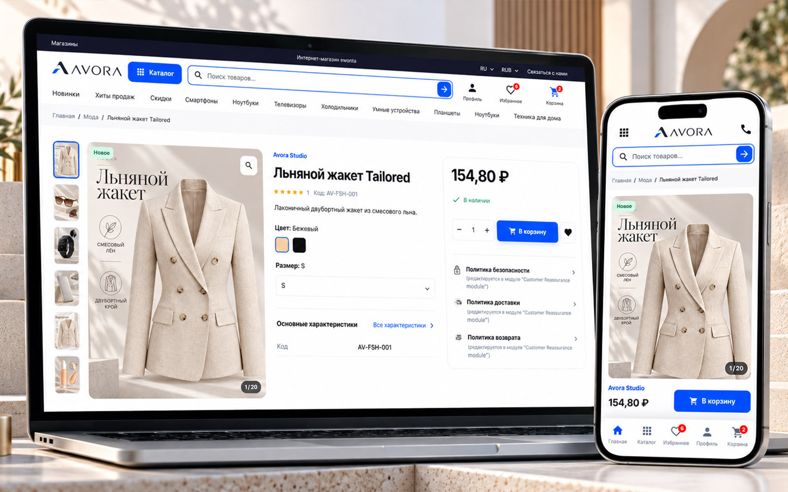
A modern product page should include more than just an image, title and Add to Cart button.
It should clearly present:
- product images;
- price;
- availability;
- product variants;
- specifications;
- description;
- delivery and return information;
- purchase controls;
- additional product details.
At the same time, the page should not become overloaded with dozens of competing blocks.
On mobile, it is especially important to keep the main purchase action easy to find after customers browse through the product images and information.
The Cart Should Be Simple
Once a product is already in the cart, the interface has a different job.
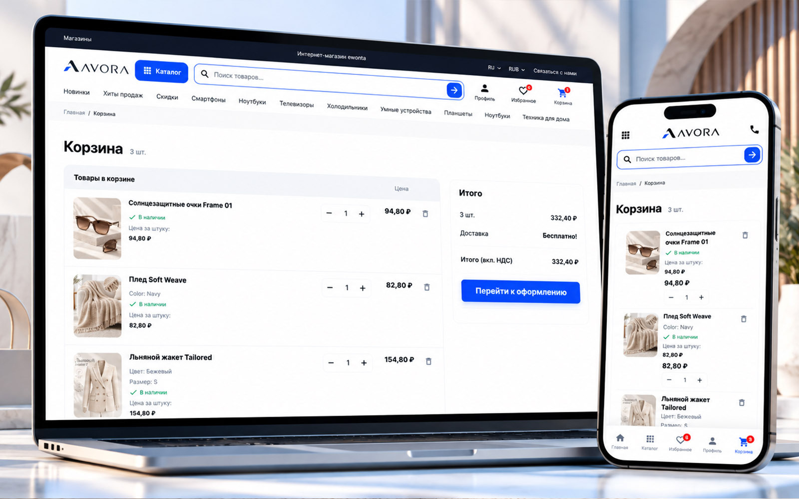
The customer does not need another sales pitch. They need to review the order and move toward checkout.
A good cart should make it easy to see:
- selected products;
- quantities;
- prices;
- total amount;
- quantity controls;
- product removal;
- the next checkout step.
The fewer unnecessary actions between the cart and checkout, the better.
PrestaShop 9.2 also introduced native One Page Checkout, allowing address, delivery and payment information to be handled on one page.
A Theme Should Be Customizable Without Constant Code Editing
Another common problem with ecommerce themes appears after installation.
The theme looks good in the demo, but changing anything significant requires editing CSS, templates or source files.
For a store owner, this is inconvenient.
A modern theme should provide enough visual controls to adapt the storefront to a specific brand without rebuilding the theme from scratch.
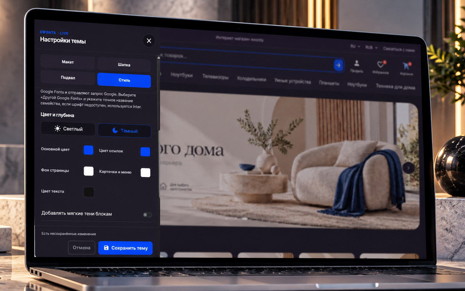
This is why Ewonta 3.0 includes a live visual theme editor.
Changes can be previewed directly on the storefront. Store owners can adjust light or dark appearance, primary colors, link colors, backgrounds, card styles and other interface elements.
This turns the theme into more than a fixed design. It becomes a flexible foundation for different brands and stores.
Why the Default PrestaShop Theme May Not Be Enough
Starting with PrestaShop 9.1, Hummingbird became the default PrestaShop theme.
It provides a modern technical foundation with a strong focus on mobile usability, performance and accessibility.
That makes it a solid base.
However, a default theme and a commercial theme solve slightly different problems.
A default theme needs to work as a flexible foundation for thousands of developers and merchants.
A commercial theme can go further by offering:
- a more complete visual system;
- additional layouts;
- extended catalog interfaces;
- more product page variations;
- built-in visual customization;
- ready-to-use ecommerce scenarios.
The right choice depends on the project.
If the store will be designed and developed completely from scratch, a default theme can be a good starting point.
If the goal is to launch with a polished storefront and then adapt it to a brand, a more complete commercial theme may save significant development time.
Ewonta 3.0 as a Ready-Made PrestaShop 9.2 Theme
This was the idea behind Ewonta Theme 3.0.
It was not created only for fashion, electronics or home products.
The goal was to build a flexible modern storefront for PrestaShop that can serve as the base for many different types of online stores.
The theme includes:
- homepage layouts;
- product catalog;
- filters;
- product pages;
- mobile interface;
- shopping cart;
- navigation;
- visual theme customization;
- light and dark interface options.
You can view the theme and live demo on the Ewonta Theme 3.0 for PrestaShop product page.
Who Is This Type of Theme For?
Ewonta 3.0 is designed for projects that need more than just a working PrestaShop installation.
It can be useful for:
- entrepreneurs launching a new online store;
- existing stores with outdated design;
- developers who need a modern project foundation;
- ecommerce agencies building PrestaShop stores;
- businesses with large product catalogs;
- stores with a strong mobile audience.
A theme does not replace proper ecommerce configuration.
Catalog structure, payments, delivery, SEO, content and business logic still need to be adapted to each project.
But the storefront itself does not have to start from a blank screen.
PrestaShop 9.2 provides a modern technical foundation for ecommerce.
But customers do not see the PHP version, Symfony architecture or internal platform improvements.
They see search, navigation, product cards, product pages, the cart and how comfortable the store is to use on a phone.
That is why a good PrestaShop 9.2 theme should solve more than one problem: making the website look attractive.
It should help customers move smoothly from the first screen to the order.
That is the approach behind Ewonta 3.0.
Theme >